Roca Barcelona Gallery

Roca Barcelona Gallery
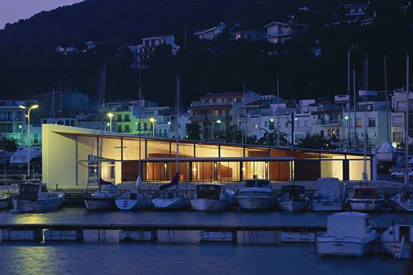
In the very first stages of conceiving the institutional headquarters for Roca (or Roca Barcelona Gallery) the architectural design was already understood as a tool for disseminating a brand and the company behind it. The building is posited on the basis of the strategy of communication, as one more way of publicizing the values, history and challenges of the company and as a broadcasting channel for attracting peoples’ interest in the products, projects and preoccupations of a company with more than eighty years of history.
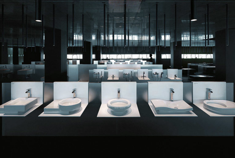
The assignment involves the carrying out of a complex program in which the institutional headquarters coexists with a museum of the brand and a platform of social events that also involve the business world.
The architectural design is based on two essential ideas: its form and outward appearance, and experiencing the space that is enjoyed inside it.
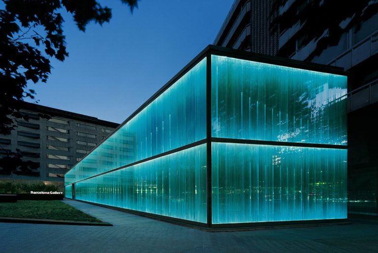
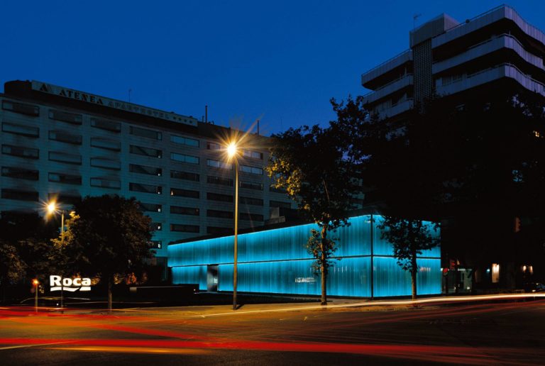
Due to its urban context, the building is surrounded by adjacent volumetries and is distinguished by its smaller size and the purity of its forms. Without resorting to the speculative formalism typical of an architecture that seeks realization through spectacle, as well as being discreet and elegant the building manages to be eye-catching and yet different to the ones around it.
When researching and working, our main objective was to conceive a facade that when looked at even cursorily would leave no one indifferent and would seek to arouse curiosity. Likewise, from the start we rejected the possibility of positing a ‘skin’ for the building that would perhaps present an attractive outward effect but which, on the other hand, would have no relationship or apparent consequence on the inside.
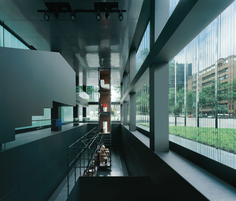
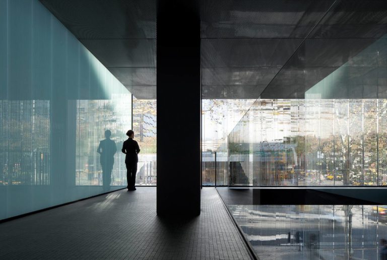
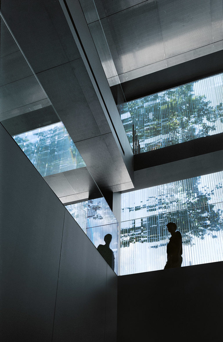
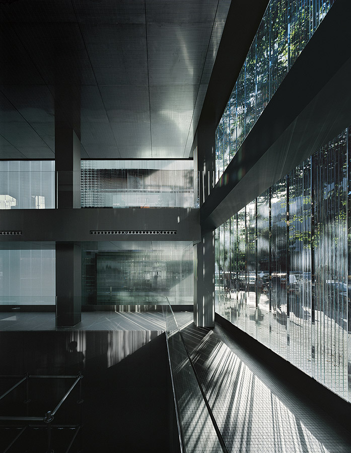
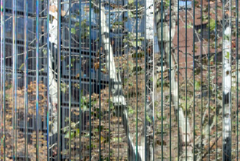
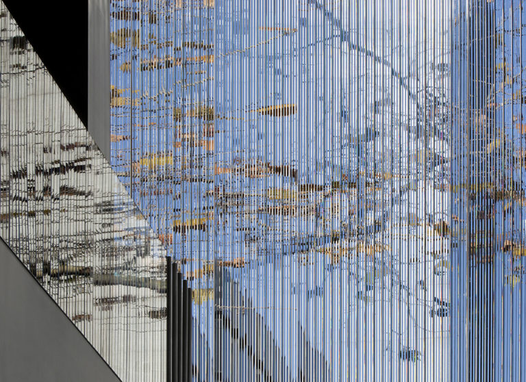
We sought, therefore, to take these premises as far as we could. Finally, after trying out different possibilities, we proposed a solution for the facade based on the way of placing a single material, a succession of multiple pieces of glass arranged at ninety degrees to the axis of the facade. Thus, on the basis of tests and prototypes, we were able to verify how new effects are produced, effects like the diffraction, reflection and refraction of light, resulting in the distortion, movement and superimposition of the image through the facade.
It was light, both natural daylight and artificial nightlight, that went on to become the main protagonist. In this way we obtained a totally ambiguous facade that appears as a solid sort of element by day and a liquid one by night, both heavy and light, rough and smooth, and it is difficult at times to recognize if its character is transparent, translucent or opaque.
Thus, when we look from the outside towards the inside of the building, the facade gives us a distorted view of the interior, obliging us to enter to really ascertain what it is, and, once inside, if we look towards the outside, towards the city, we observe a whole set of visual effects, almost as it were a game in which nothing is where it really ought to be. Beams of light cross in a straight line, while other beams are reflected upside-down, producing something akin to a superimposition of the image. At the same time others are also diffracted and present all the colors of the rainbow.
From within, we observe streets where before there were none, buildings are duplicated and we see pedestrians walking around and it seems they’re where we see them, but in actual fact they’re in some other physical place entirely. Our objective was fulfilled, given that we were after the creation of a facade that, whenever one looked carefully through it, would offer a perceptual effect that was plausible and at the same time subtle.
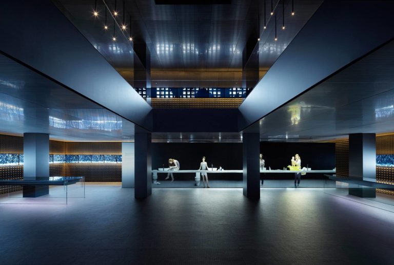
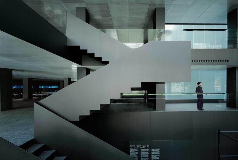
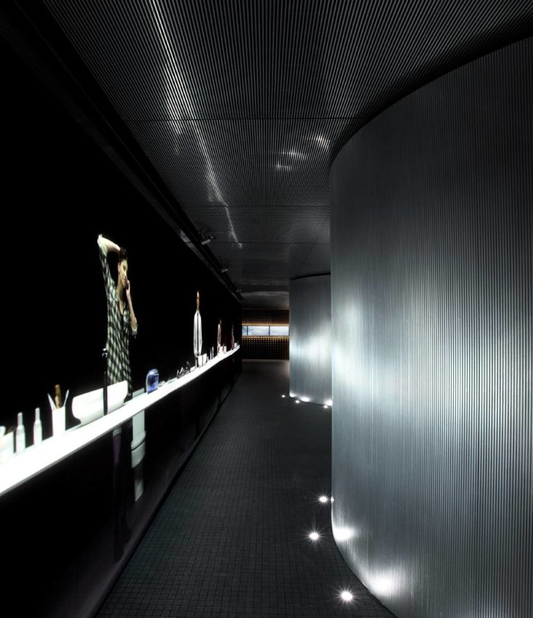
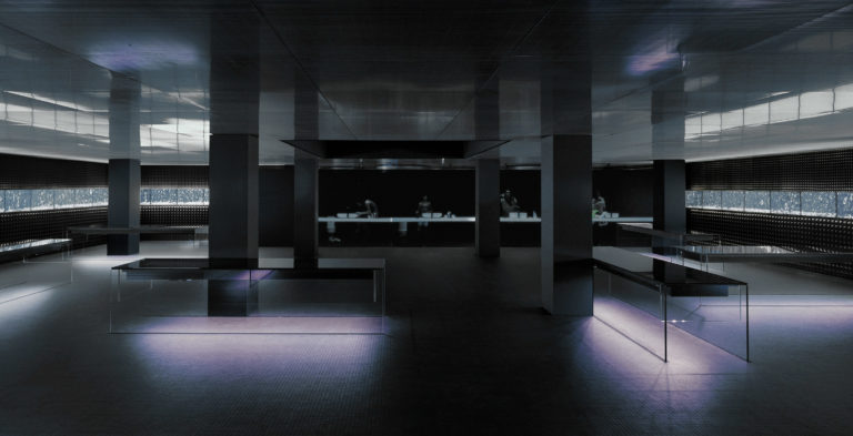
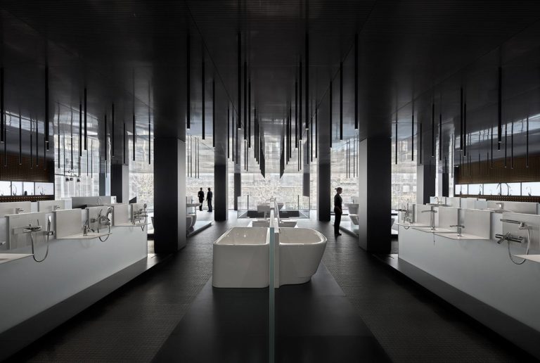
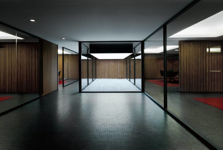
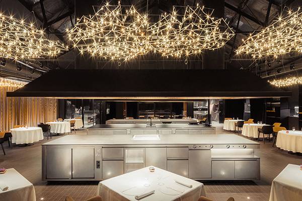
A building projected outwards, which seeks a world, a space and a unique ambience within. Through the use of light, audiovisual systems, materials and display elements, we have attempted to generate an interior space that is very different to the usual exhibition space, where the visitor lives through an intense, unique experience with the building. The interior space, then, is conceived as a personal, sensorial experience in which the user interacts with the building thanks to presence detectors, directional loudspeakers, changes of light, projections, projected characters that act with the visitors, and plasma screens that project objects in movement. All these features are ‘inserted’ in turn, as if they floated in an indivisible, continuous space. A slightly reflective, experimental, ceramic flooring, a false ceiling in stainless steel and walls of foam tetrahedrons go to form the three main materials. All of them are continuous materials, three planes that due to their state of continuity recreate a weightless space that emphasizes horizontality and lacks spatial or formal references, thus converting physical space into a sort of virtual space.
The technology applied to the actual building, the audiovisual systems and the way of explaining the brand and its products are essential to transmitting the commitment the company has towards the future. The design for Roca Barcelona Gallery echoes the most advanced technologies in matters of lighting and of materials like ceramic, glass and steel.
To achieve all this it has been necessary for Roca and the OAB team (Borja, Lucía and Carlos Ferrater) to fall back on a group of experts in such varied fields as communications, construction, lighting and audiovisuals, as well as many other excellent specialists, all of whom have made the creation possible of a state-of-the-art building that is an emblem of the Roca brand.
EXHIBITIONS
2022
- 'Limites, systèmes, transformations, la poétique de la matière dans l'architecture du XXlème siècle' at the ENSA Paris Val de Seine. March 2022
2012
- “OAB - OFFICE OF ARCHITECTURE IN BARCELONA”. Hall of the UEM.
