Tangram House in Angelo Drive, Beverly Hills
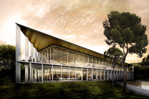
Tangram House in Angelo Drive, Beverly Hills
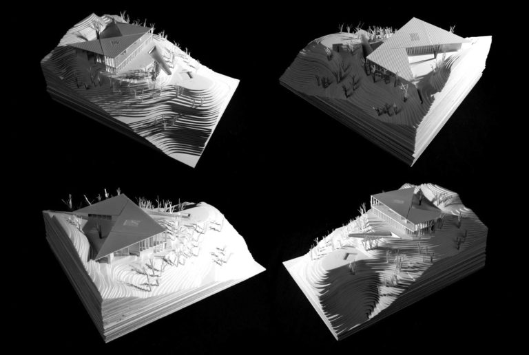
TANGRAM is a dissection puzzle consisting of seven flat shapes called tans. Putting them together the objective is, given an outline or silhouette, to create a specific shape using all seven pieces that will not overlap.
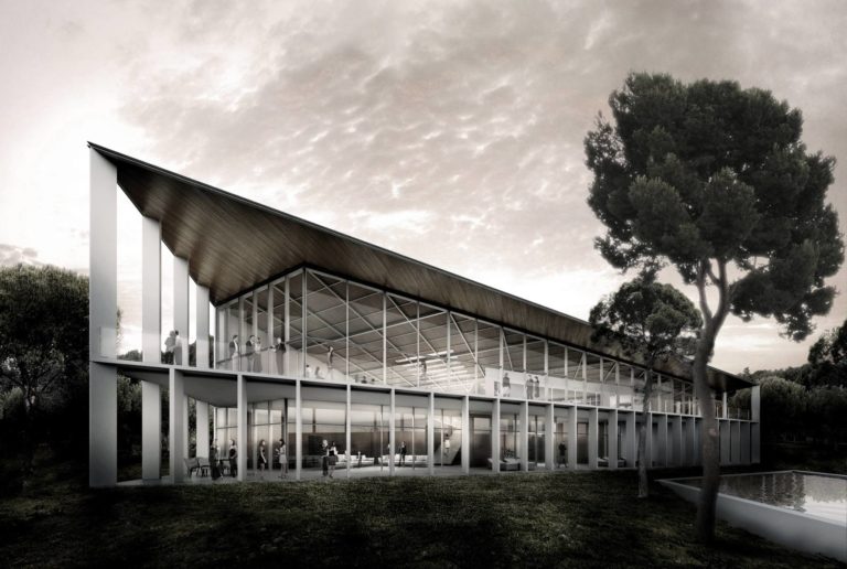
The relation between the game and our project has become casual but highly significant. Our aim to simplify the project highlighting its most important aspects leaded us to relate the project with this brilliant, yet simple, puzzle game that allows one to represent multiple shapes from the very starting point. TANGRAM uses seven geometric shapes and with which one can start creating multiple possibilities. Our project had very clear premises from day one, such as natural relationship with its landscape, a perfect program organization and a beautifully finished object designed to be seen from different places.
We always wanted to turn these main three issues into a very powerful and clear solution, taking as a fundamental belief the strength of abstraction in architecture.
We wanted to simplify the form while transmitting these important concepts with energetic geometrical shapes. This kind of logic and thinking is well related with the abstraction, rigor and severity that have been used in modern architecture along the 20th Century, having California as a magnificent epicenter.
MODERNISM REDISCOVERED
In the 1950’s photographer Julius Schulman conducted an exhaustive analytical journey through some of the most relevant houses of the Californian coast. All his pictures were published in a comprehensive trilogy that helped the future generations to understand the transcendence of the work done by clients, and architects, during the years following World War II in California. Architects such as Richard Neutra, Craig Elwood, Charles and Ray Eames, Pierre Koenig… designed some of the most famous “Case Study Houses”. It is important to take a look into this splendorous time in California when, after World War II, architects from all over Europe started working and building single family houses for wealthy growing families. This historic moment took many architects to work on a specific character and style, very much inspired on the big figures of the International Modern Movement, but always with a new fresh American touch and personality.
It is our aim to bring back the essence of such a great period but with a Contemporary approach and spirit. We want to present this timeless structure as a shape taken from geometric patterns. A shape that could be used today, 50 years ago and 50 years from now. “Looking into the past to project the future” we tried to bring back this spirit in order to have a new and reinvented Modernism.
STRATEGY
Topography
The house, positioned on the upper section of the hill’s ridge, follows its surrounding landscape and adapts to it. The general topography of the area gives us advantages in advance. It is not hard to see that the way the urban settlement works in the area is by enhancing the characteristics of the mountain locating the luxurious single-family houses at the edges of the different ridges. It seems obvious to adopt this strategy so that houses have privileged views and sun light throughout the day.
In our particular case the house works quite well specially on the East side, however there is a higher ridge than ours on the west side making a slightly harmful condition on that side since both we don’t have then as good views to the west and also we need to preserve the intimacy and avoid being seen from above. The house starts by taking this premise into consideration and so the first decision is to locate the service areas on the less privileged part of the house, the West side.
Views and Orientation
We configure the house so that it can enjoy as much as possible the views and, at the same time, have the best light orientation available. As stated above, the strongest views and orientation go from East to South West. These are the main principles when configuring the program versus the orientation:
- East / South East Side: Sun rise and morning light is specially ideal for rooms.
- East, South East and South (and even a small portion of North light) are given to the main bedroom.
- South East, South and West are given to the big common spaces, living rooms etc.
- South West is also ideal for dinning room where one can see the beginning of the sun set, the far away city down town, and also, maybe (only tested through Google earth) there could be a slight view of the ocean.
- The less significant South West views are given to the kitchen. Our desire is to have trees facing the windows of the kitchen as well as maybe get some far away city views. We suspect that these are the less attractive views.
- West side is given to the service areas, where the staff members could have their own outbuilding house.
Terrain
All terrain movements stay within the plot:
We know this is a sensitive point in terms of budget and time costs. So this is why we put special care in diminishing as much as possible all the excavations and terrain modifications. We ensured that with this solution there is very little excavations to do, however they are necessary in order to counterbalance some weak topographical areas. We found out that nowadays the road that brings you from the entrance of the plot to the first level plateau needs to go down about 8 meters (24 ft), meaning that currently we have about 18% slope. We think it would be beneficial for such a luxury property to try to diminish this slope a bit. This is why we propose to take excavated land below to raise the entrance plateau about 60 more centimeters (2 ft). It is a slight movement of land, easy to do, but it will make a difference since the ramp will diminish, at least the final part of the entrance road, to a less aggressive slope of about 15 %. Also this 60 cm level increase makes it easier for construction and less excavation in the lower level and helps emerging a bit more from the trees to get better city views.
Circultation
As vehicular and pedestrian circulation within the plot no major changes have been introduced. We have respected all preexistent roads and walkways inside the plot. This is important in order to avoid extra costs.
PROGRAM
General
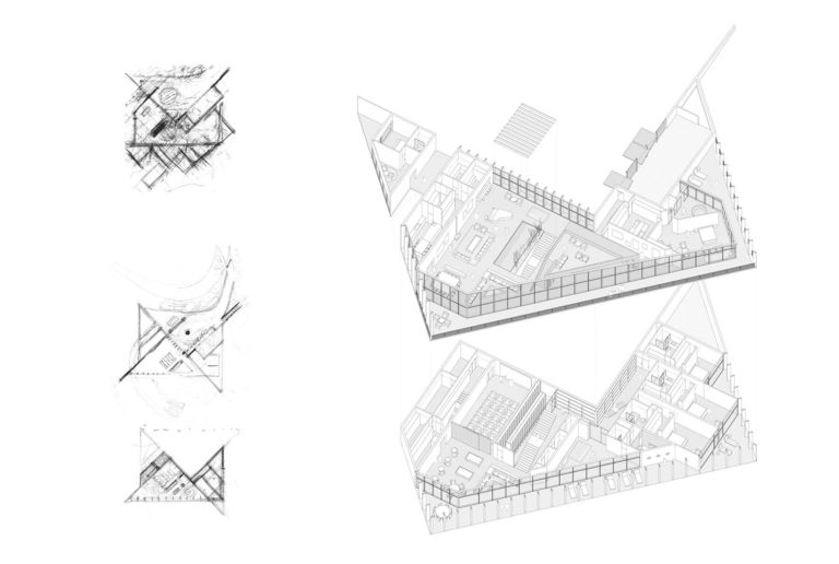
The house, adapting to the preexisting terrain platforms, is conformed in two levels connected by a main stair, two secondary ones and an elevator. Both floors are divided in three main areas that try to respond not only to the circulation and functional diagrams but also to the performed light and views studies. Therefore we have:
- A private wing, oriented to the East and Southeast, with morning light and views over the City, which contains the master bedroom (on the entrance level) and the guest rooms (on the garden level).
- A public wing, oriented to the South and Southwest, with natural light and views all day long. Here we find the entrance foyer, the library/office space, the living room (on the upper and mezzanine level) and the gymnasium, cinema and games area (on the lower level).
- A service/staff wing, oriented to the West and with worse light and views conditions due to the neighbor hill. It includes the kitchen area, pantry, storages, staff room, security room,…
All rooms facing orientations going from East to Southwest have an adjacent exterior livable terrace that not only adds and extra value to the space but also helps protecting the interior from excessive solar radiation. On the upper level this terraces have 2.25m (7.4’) as the minimum depth while on the garden level the depth grows up to a minimum of 3.15m (10.4’).
Entrance Level
The entrance level, as previously explained, is divided in three different wings, each of them with an adequate orientation and views according to their needs. Circulation between each of the main areas was studied thoroughly for each kind of potential users (owners, family, guests, visitors, staff…). There are three accesses to the house in the upper level, one for each of the areas. Firstly, a main entrance is strategically located in the middle of the public wing, which allows a general view of the great living space and some first views of the city through the glass façade. From this point either owner or guests can be rapidly connected to all main spaces in this floor, such as the living room, dining room, piano lounge, cocktail bar and office, but also to the lower level areas through the main stairway. Secondly, there is an access directly from the garage that goes to the private wing. This gives the owners the option to access their master bedroom with no need of going through the living areas. Finally, there is a covered exterior area that gives staff a direct access from their chambers to the service area of the house. That is: the kitchen, pantry, storage and laundry room. Also from this point electric cars can go down to the lower level while delivery vans can use it as a loading/unloading area.
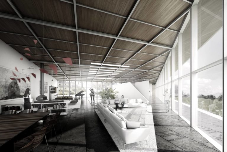
In addition to dividing the house in these three different wings each one of them is subdivided in different areas in order to create adequate atmospheres for their diverse functions and activities. As a result, the main living area has cozier areas such the fireplace or the piano lounge, both with a lower ceiling, and greater spaces such as the dining room or the living room, with extraordinary views to the city. An exempt isle in the middle of this grand space accommodates an office/library space over which we can find a mezzanine level, which can work as a more private common room and as a balcony with the best views of the house, also may be called the family/private or TV living room. This same isle includes the elevator that connects both levels and a small restroom for visitors. Similarly, the master bedroom is also subdivided in three different spaces and an exterior terrace. These are: a complete walk-in closet, a bedroom with sleeping, reading, breakfast, and fireplace areas, and a fully equipped bathroom.
Garden Level
The garden level follows the same configuration as the upper level: three main areas (private, public and service) with studied connections and circulation between them. Each one has a relation with the entrance level through a stair carefully designed for its specific purpose. Therefore, the above public area is connected by a sculptural stairway (and the elevator) to the lower one. From it there is a swift path to the gymnasium, playroom, wine cellar or cinema. Also, from the private area above there is a private staircase that rapidly connects to the garage and the master bedroom with both the gymnasium and the guest rooms below. Finally, a discrete staircase in the service area helps the staff moving from the upper level to the garden area.
Each area is, likewise the entrance level, subdivided in different zones. Hence, the public area contains a cinema for twenty people, a wine cellar with space up to 5100 bottles and a table for wine tasting, a common room and a recreational zone with pool tables, poker table… Also in this area, but closely related to the private wing and the exterior pool terrace, we can find a fully equipped gymnasium, with changing room and sauna included. The private area consists of three comfortable guest rooms, each of which has a direct connection to an exterior terrace and to the garden. Lastly, the service area is divided in storage space, a security and audiovisuals room and a kitchenette connected to the main kitchen through a dumbwaiter.
In this floor we also considered some MEP spaces. There is a big MEP area below the garage, connected to it through a double height space and a circular staircase. A smaller installations room is placed on the service wing, by the storage and security rooms.
CONSTRUCTION
We would like to express, first of all, that this is not a complex building in terms of constructability. The lower level can easily be built with conventional techniques either with steel or concrete columns, or even sheering walls if preferred. The lower level has no major complications in terms of structure since there are plenty of opportunities to introduce anti-earthquake structural elements. On the upper level we also think it is not complicated at all since there is only a thin and light roof to hold. By only building two levels we avoid lots of problems for loads, etc. that we would have if we did more than 2 levels.
Structure
We propose a mixed structure of steel columns and beams, retaining walls and load bearing walls. Such walls will help for horizontal stability given the seismic conditions of Los Angeles/California Area. We are positive that no major problems would arise for building this house, and we would be glad, if winning, to offer the client a pre-analysis structural report exposing the main strategy taken.
MATERIALITY
Roof
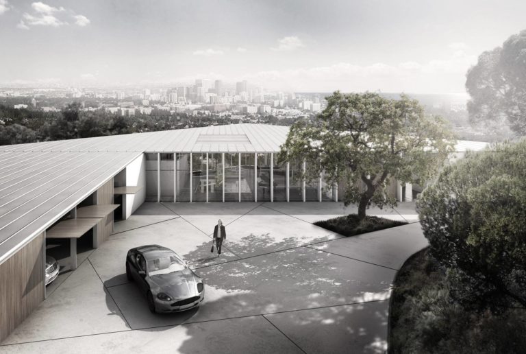
Aesthetically speaking, the Roof is understood as the 5th façade of the building. One that will be seen from above, when reaching the house but also when seeing it from the distance. Our aim is to get a very thin and light structure that covers the whole footprint of the house. The construction detail would be simple, a properly insulated roof covered by a steel or aluminum deck (Kalzip type), a light roof that is easy and fast to build, airy and with low maintenance needs.
The main idea is to have a single plane with just two gutters that not only symbolically draw the boundaries between the three main areas but also help collecting the water, when the length of the roof is most important, and gathering the different exhaust chimneys, such the ones for the fireplace, kitchen,… This allows us to have three completely clean and neat metal surfaces.
Interior wise, as shown in our rendering, we suggest to let the structure be naked and visible, thus becoming an honest building showing its structure and in relationship with the principles of the Modern Movement. However, if desired by the final owner, OAB could design a more sophisticated suspended ceiling in which raw materials were not seen. In this case beautiful wooden boards and specific in-case lighting, specially carved and designed, would conform a high end suspended ceiling that would cover the whole space.
LANDSCAPE
Entrance
We envision the entrance space as a formidable access to the high-standing house designed. When approaching to the house through the ramp coming from Angelo Road magnificent views of the city will start appearing in one’s vision. At the same time the pure geometry of the house will be slowly showing up and defining the entrance plaza. A plaza carefully designed as a remarkable space made of stone and dominated by a splendid noble tree.
Swimming Pool
We would like to present this radical, and yet simple, shape for the swimming pool. This pure form would project itself from the terrain to the horizon, creating a beautiful and sculptural cantilever pool.
The proposed swimming pool has enough dimensions to allow a perfect swimming lap of about 25m (half an Olympic pool) but yet it tries to minimize its size by giving a pointy shape in its ending.
Guest Pavilion
We left the possibility to introduce a secondary small building on the lower part of the plot to work as a guest pavilion or as a multipurpose pavilion. This level could even be understood as a hypogeum. A charming area in the middle of the woods for special guests, parties and BBQs… ready to be developed in the next design stage.
